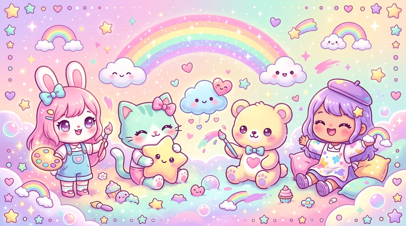
Have you ever noticed how a simple glance at a soft-toned Japanese illustration can instantly melt your heart and wash away the day's stress? There is something magical, almost therapeutic, about the "kawaii" aesthetic. It’s no coincidence: it all comes down to a subtle and joyful science. Whether you are a budding artist or a coloring enthusiast, mastering kawaii-style colors is the key to turning your drawings into little visual treats.
Why Do Our Hearts Melt for Sweet Shades?
The term "kawaii," meaning "cute" in Japanese, refers to more than just small characters with big eyes. It is a true philosophy of gentleness. Psychologically, the colors we associate with the kawaii style act like a hug for our brains. Light, bright, and low-saturation hues evoke the innocence of childhood, tenderness, and security.
When you use kawaii-style colors, you aren't just filling in empty spaces; you are creating an atmosphere. These colors trigger a positive emotional response, reducing anxiety and stimulating creativity. It is this visual harmony that makes Japanese illustrations so irresistible. By understanding how these shades interact, you will be able to infuse that same magic into your own creations.
The Art of Softness: Understanding the Psychological Impact of Pastel Tones
The secret of kawaii lies in clarity. Unlike bright primary colors that grab attention through intensity, pastel tones are soothing and welcoming. Here is why they are the pillars of any successful kawaii color palette:
- Candy Pink: A universal symbol of tenderness and affection. It provides an immediate touch of warmth.
- Sky Blue: Evokes serenity, lightness, and escapism. Ideal for backgrounds or calm little characters.
- Pastel Yellow: Brings joy, gentle energy, and light. It is the ultimate color of optimism.
- Fresh Mint: A refreshing color that balances overly warm tones and adds a touch of modernity.
"Kawaii is not about excess, but balance. One well-chosen pastel color is better than ten garish ones."
When choosing your shades, remember that the goal is to create visual harmony. Too many saturated colors can "break" the cute effect. Always prioritize nuances that seem to belong to the same family of softness.
Building Your Palette: Winning Trios for an Irresistible Look
Choosing markers can sometimes be complex given the multitude of shades available. To avoid mistakes, the simplest technique is to work by themes. Here are some essential combinations to perfect your kawaii color palette:
The "Sweet Treats" Trio
Inspired by Japanese pastries, this palette focuses on indulgence:
- Powder pink (for cheeks and accessories)
- Light lavender (for a mysterious and soft touch)
- Vanilla cream (for neutral and luminous bases)
The "Dreamy Sky" Trio
Perfect for giving your characters a sense of space and lightness:
- Very light azure blue
- Soft peach
- Off-white (used for highlight areas)
The "Spring Garden" Trio
For a fresh and natural look:
- Mint green
- Butter yellow
- Light coral pink
Bringing Your Drawings to Life: Gradient Techniques for a "Fluffy" Feel
Once you have selected your kawaii-style colors, the next step is to add depth. Kawaii coloring does not aim for pure realism, but rather for a "cuddly" and voluminous look. To achieve this effect, the gradient technique is your best ally.
The "Cloudy" Gradient
Use two shades of the same color (one light and one slightly darker). Apply the darker color to the edges of your area, then blend toward the center with the lighter color. This instantly gives an rounded and "puffy" appearance to your characters, which is the very signature of the kawaii style.
Practical Tips for Choosing Your Markers
When starting out, it’s not always clear which materials to prioritize. Here are our recommendations for harmonious coloring:
- Opt for alcohol markers: They allow you to layer colors without leaving streaks, which is ideal for smooth gradients.
- Test your colors on a scrap piece of paper: The color on the marker cap is rarely identical to the result on paper.
- Don't neglect white: Keeping white areas (highlights) is crucial to giving your illustrations life and sparkle.
Ready, Set, Color!
Now that you have all the keys to master kawaii-style colors, it’s time to put them into practice! The most important thing remains the pleasure you take in creating these little bubbles of happiness on paper. Don't be afraid to experiment, mix your palettes, and let your own sensibility shine through.
Do you want to apply these tips right now? We have prepared an exclusive selection of printable coloring pages for you, specially designed to test our favorite palettes. Whether you are a fan of adorable little animals or smiling treats, you will find exactly what you need in our dedicated library.
Join our community of enthusiasts! Share your most beautiful creations on social media using the hashtag #KawaiiColoring and show us how you used our tips to create a harmonious coloring. Click here to discover our new kawaii coloring pages and let the magic happen!