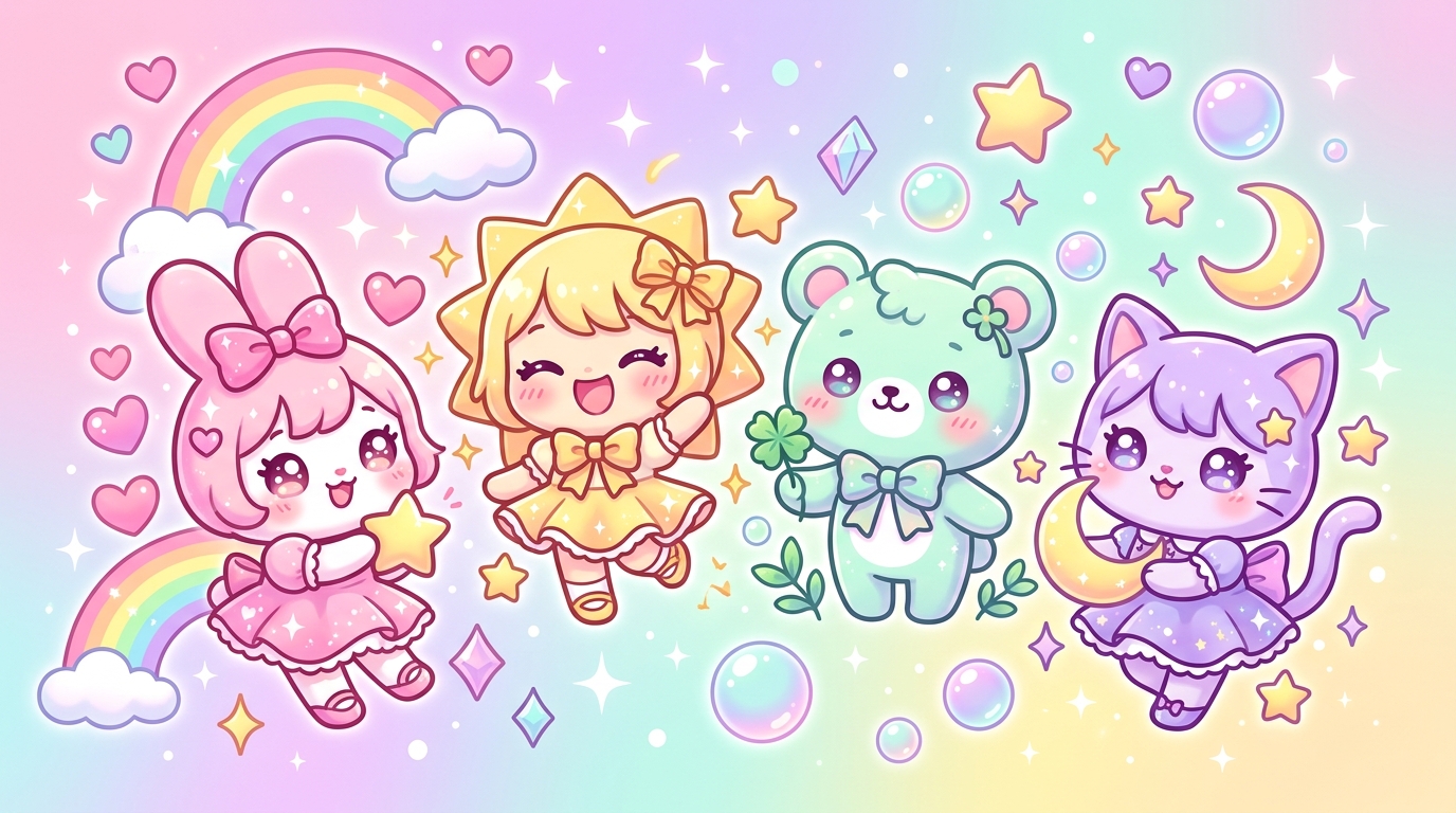
Have you ever felt that little tug at your heartstrings, that immediate smile spreading across your lips as soon as your eyes land on a character with big, bright eyes surrounded by soft hues? It’s no coincidence! The Japanese style, a true master of the art of "cute," is built on a universal visual language: kawaii colors. These shades aren't just aesthetic; they are powerful vectors of positive emotions that act like a visual hug for our brain.
Why We Instantly Fall for the Magic of Kawaii Colors
The kawaii phenomenon, which literally means "adorable" in Japanese, goes far beyond the simple scope of drawing. It is a complete sensory experience. When we choose kawaii colors for our coloring, we aren't just filling in white spaces: we are creating a cocoon of well-being. Psychologically, soft tones recall the innocence of childhood, safety, and tenderness. It’s a welcome escape into a world where everything is light, kind, and joyful. By using these shades, we activate areas of our brain associated with relaxation and stress reduction.
Softness Personified: Why Pastel Shades Are Your Best Allies
Pastel shades are the central pillar of any self-respecting cute creation. Unlike saturated primary colors, which can appear aggressive or overly stimulating, pastels possess a soothing luminosity. They are achieved by adding a touch of white to a pure color, which decreases its intensity while retaining its emotional "personality."
The Soothing Power of Sky Blue and Candy Pink
Pink is undeniably the queen color of kawaii. It symbolizes affection, sweetness, and positive vulnerability. Paired with a very pale sky blue, it creates a perfect balance between tenderness and serenity. These two hues together evoke a spring sky, a soap bubble, or cotton candy. It is the ideal base to start your coloring if you are looking to establish a calm and comforting atmosphere.
Clarity, the Secret to Lightness
Pastel colors are not just shades; they are "visual clouds" that instantly lighten the weight of daily worries.
By working with light palettes, you allow the eye to rest. This is why kawaii characters always seem to "float" on the page: they are visually light and accessible.
The Art of Harmony: The Kawaii Version of the Color Wheel
To create a kawaii color palette that works every time, it isn't enough to just pick randomly from your box of markers. There is a science behind visual harmony. By using the color wheel, you can create combinations that feel "naturally" pleasing to the human eye.
Analogous Accords for Infinite Sweetness
Analogous harmony consists of choosing colors that sit side-by-side on the color wheel. For example: pale violet, pastel pink, and peach. Since these colors share common pigments, they blend wonderfully and create a sense of fluidity. This is the preferred technique of Japanese illustrators to give that "blended" and harmonious look to kawaii backgrounds.
Gentle Contrast: The Exception That Proves the Rule
Sometimes, to make a kawaii character stand out, you need a slight contrast. Rather than using overly dark opposite colors, play with saturation. Combine a very light butter yellow with a pastel turquoise. The contrast is there, but it remains soft and joyful, avoiding the disruption of your coloring's cozy atmosphere.
Telling an Emotion: Combining Shades to Create an Atmosphere
Every kawaii color palette you compose tells a story. Do you want your coloring to be an invitation to a nap, a burst of laughter, or a gourmet adventure? Here is how to choose your shades according to the desired emotion:
- "Sweetness and Sleep" Atmosphere: Use lavender, powder pink, and cream white tones. These colors are perfect for sleepy characters or fluffy clouds.
- "Joy and Energy" Atmosphere: Introduce touches of lemon yellow, mint green, and apricot. These colors evoke freshness, sunshine, and vitality.
- "Gourmet" Atmosphere: Rely on milk chocolate, wild strawberry, and vanilla tones. This is ideal for coloring small animals surrounded by pastries or candies.
Practical Tips for Your Coloring
To succeed in your projects, never forget these three golden rules:
- The Rule of Three: Do not overload your drawing. Choose one dominant color, one secondary, and one accent touch.
- The Importance of White: Leave white or very light areas. Empty space is a color in its own right in kawaii design; it allows the eye to breathe.
- Test the Gradient: Try blending two pastel shades together. The transition from pink to violet is a great classic that immediately gives a professional and magical look to your creations.
Your Turn: Create Your Own Pastel Universe
Now that you have mastered the secrets of kawaii colors, it’s time to take action! The theory is fascinating, but nothing replaces the pleasure of paper under the pencil. Color psychology is a powerful tool to transform a simple moment of relaxation into a true creative therapy session.
We would love to see how you use these tips to bring your favorite characters to life. Don't hesitate to share your masterpieces on social media with the hashtag #MyKawaiiWorld. And to practice right now, we have prepared an exclusive selection of new coloring pages, accompanied by tip sheets on the palettes to adopt for each theme!
Ready to color? Discover our new library of kawaii coloring pages now and let your creativity express itself in an explosion of pastel sweetness!