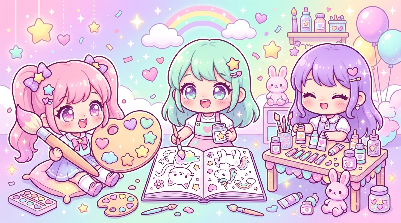
Have you ever felt that slight frustration when finishing a coloring page that, despite all your efforts, just doesn't seem to capture that sweet, sparkling magic typical of Japanese illustrations? You know, that feeling that your characters are missing that little "something extra," that irresistible aura that makes people say "oh, it's so cute!" at first glance. Don't worry, it's not your talent that's the problem, but simply a matter of the right kawaii color palette!
The kawaii style is a precise art that relies on very specific visual codes. If your colors clash without any rules or if they are too bright, the harmony falls apart. Learning to master nuances is a bit like learning to cook a secret recipe: with the right ingredients, your coloring will transform from a simple drawing into a true sugary work of art. Ready to make your markers sparkle? Follow the guide to create the perfect harmony!
The Art of Sweetness: Diving into Pastel Aesthetics
Kawaii is above all a state of mind: tenderness, joy, and childhood. To translate this onto paper, kawaii color theory is your most precious ally. Unlike classic illustrations that play with strong contrasts, the Japanese style favors absolute softness.
Why Pastel Tones Reign Supreme
Pastel colors possess high brightness and low saturation. In color psychology, they are associated with calm, safety, and happiness. When you color a little character with pastel tones, you immediately create a positive emotional connection with anyone looking at your drawing. The idea is to create a bubble of softness where every element seems to float in a sweet dream.
The secret to a successful kawaii color palette lies not in multiplying colors, but in the consistency of their intensity.
Secrets of Harmony: How to Combine Your Colors Without a False Note
The most common mistake when starting out is wanting to use too many different colors on a single drawing. The result? The eye gets lost, and the "cluttered" effect takes over the cute factor. Here is how to structure your approach for an impeccable pastel color harmony.
The Golden Trio Rule
To never go wrong, start by selecting three dominant colors:
- The "Candy" color: A powder pink, sky blue, or lilac that will serve as a base for your main character.
- The "Cream" color: A very light neutral shade (butter yellow, cream, vanilla) to provide light.
- The "Accent" color: A slightly more vivid touch (mint green, peach) to highlight details like cheeks or small accessories.
How to Avoid Visual Saturation
To keep that lightness unique to the kawaii style, don't hesitate to leave areas of white or uncolored paper. Empty space is a color in its own right! It allows your drawing to "breathe." If you feel your coloring is becoming too heavy, it's likely that you emphasized the outlines too much or your colors are too similar in terms of brightness. Always remember to vary intensities: a very light area next to a slightly darker one immediately creates depth without breaking the pastel effect.
Practical Guide: Essential Supplies for Dreamy Gradients
Having an idea of the ideal kawaii color palette is good, but you still need the right tools to apply it. The choice of your markers or pencils is decisive for achieving that smooth, uniform finish seen in manga.
Choosing Kawaii Markers: Alcohol vs. Water
The choice of kawaii markers is a crucial step for enthusiasts:
- Alcohol markers (like Ohuhu or Copic): This is the number one choice for achieving perfect gradients. The ink blends itself on the paper, creating invisible transitions between two shades of the same color. It is the king tool for uniform fills.
- Wax-based colored pencils: These are perfect for adding texture to cheeks or light shadows. Use a blender to fuse your pigments and get a velvety finish.
Techniques for "Sugary" Gradients
To succeed with your gradients, always start with the lightest color. Apply it over the entire area, then add the slightly darker color on the edges or in the corners. Go over the junction between the two shades with your light color again. It is this back-and-forth motion that will "fuse" the colors and give that professional and oh-so-cute look.
Your Kawaii Adventure is Just Beginning!
Creating your own kawaii color palette is a liberating creative experience. Once you understand how to harmonize your pastel tones, you will see that your coloring pages take on a whole new dimension. Don't be afraid to experiment, try new combinations, and above all, have fun!
So, ready to take action? Download our free kawaii color chart kit now to start building your own collection of favorite colors. And don't forget to share your most beautiful creations on social media by tagging us; we can't wait to see how you interpreted these tips!
Looking for new challenges to put your new knowledge into practice? Discover our exclusive library of kawaii coloring pages to print today. From round little animals to adorable sweets, you're bound to find your next favorite project to test your new palette. Happy coloring!